What Makes a SaaS Explainer Video Actually Convert?
Most SaaS explainer videos fail to convert because they focus on features instead of guiding viewers through a clear problem-to-solution journey. The best converting videos speak directly to what keeps buyers up at night, address their exact situation, and build confidence that your product solves it.
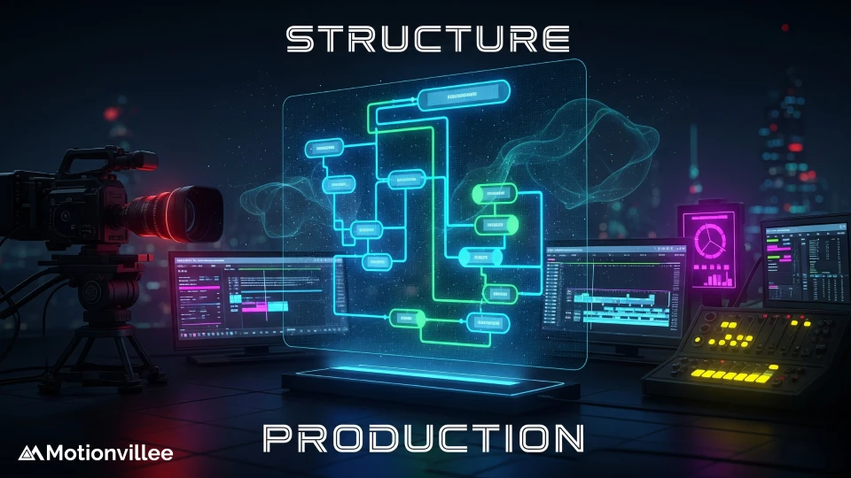
Understanding how to structure SaaS explainer video conversions requires strategy, not just polished production. A beautifully animated explainer might get views but won’t drive demos. A well-structured explainer with the right messaging moves prospects toward taking action.
The difference between failing and succeeding explainers comes down to three things:
- They open with the viewer’s specific problem, not your company background
- They show how your solution solves that problem step by step
- They end with a clear, specific next step the prospect can take immediately
Why Does Your Explainer Video Structure Matter More Than Production Quality?
Your viewers decide within the first 3 seconds whether to keep watching, and structure determines if they stay engaged long enough to convert. Even expensive animation and premium voiceovers won’t hold attention without strategic sequencing.
Most companies believe higher production quality leads to better SaaS explainer video conversions. Polished graphics, professional animation, and perfect audio certainly feel professional. But they don’t make someone book a demo. Conversions depend on what you say and how you sequence it, not how fancy it looks.
Structure creates psychological momentum that guides prospects from problem awareness to action:
- Problem recognition (they hear their exact pain point named)
- Urgency building (they understand the cost of waiting)
- Solution introduction (they see how you fix it)
- Clear CTA (they know exactly what to do next)
Without this structure, even stunning visuals won’t move prospects to action. Your script, pacing, and messaging sequence are the invisible forces that drive conversion.
Two videos with identical production budgets can deliver completely different results based purely on SaaS explainer video structure.
Understanding the complete workflow shows how structure planning fits within the broader production process.
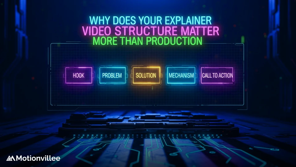
What Are the 4 Essential Elements Every SaaS Explainer Video Must Include?
Every SaaS explainer video must open with a hook, name the problem, explain your solution, and end with a clear call-to-action, in that order. Each element serves a conversion purpose, not just storytelling.
The opening hook (3 seconds)
This isn’t a company logo or tagline. It’s a statement that resonates with your target buyer. Compare these two opens:
- Weak: “We’re a SaaS platform for enterprise productivity”
- Strong: “Your team spends 8 hours per week on manual data entry”
The strong hook says “I know your pain, and I’m here for the next 60 seconds.” It demands attention because it’s specific to their situation.
The problem statement (15-20 seconds)
- Don’t assume viewers understand the cost of inaction. Make it explicit. What does the problem cost them monthly? How many missed opportunities? How much team frustration? This agitates the pain and builds urgency for a solution.
The solution explanation (45-60 seconds)
- Show how your product eliminates the problem. Focus on outcomes, not features. Don’t explain every button in your interface. Explain what changes after they use you. How much time do they save? What becomes possible? Our explainer video services structure this section to emphasize results over functionality.
When getting expert help, ensure they structure this section to emphasize results over functionality.
The call-to-action (10-15 seconds)
- Your CTA must be crystal clear and appear before the video ends. Don’t bury it in the final frame. By minute 1:30, 30% of viewers have already left. Your CTA needs to appear at 45-60 seconds, not at the end. Make it obvious: “Book a demo,” “Start your free trial,” or “See this in action.” A weak CTA kills conversions even when the rest of the video is strong.
How Should You Sequence Your Explainer Video for Different Buyer Awareness Levels?
One explainer video structure doesn’t work for all buyer stages. You must adjust your messaging based on where prospects sit in the buyer journey. Generic explainers convert poorly because no single version speaks to every awareness level.
For unaware buyers (early awareness stage)
These prospects don’t yet know a solution exists. Emphasize the problem and its impact. Lead with “Does this sound familiar?” and paint a vivid picture of the frustration they face. Your goal is making them realize they have a costly problem, not positioning your product yet.
Structure focus:
- 60% problem explanation
- 30% solution concept
- 10% your product positioning
For problem-aware buyers (mid-stage)
They know they have a problem and are evaluating options. Shift your focus to solution benefits. Show how solutions like yours eliminate the pain. Highlight what changes when they act: faster workflows, cost savings, better visibility, reduced risk.
Structure focus:
- 30% problem acknowledgment
- 50% solution benefits
- 20% your product positioning
For solution-aware buyers (late stage)
They’re comparing vendors and need proof that you’re the best choice. Your explainer structure emphasizes differentiation and ROI proof. Reference results, customer outcomes, and specific competitive advantages. They’re ready to decide.
Structure focus:
- 10% problem (they already know)
- 30% solution benefits
- 60% your differentiation and ROI
Your SaaS explainer video structure emphasizes differentiation and ROI proof. Reference results, customer outcomes, and specific competitive advantages. They’re ready to decide.
This funnel approach ensures your messaging aligns with each prospect’s mindset. A video that tries to educate unaware buyers AND convince solution-aware buyers will do neither effectively.
For companies building comprehensive strategies, create separate explainers for each buyer stage rather than one generic version.
How Do You Write a Script That Converts Viewers Into Demo Requests?
A strong explainer video script uses simple language, names your specific problem, creates urgency, and ends with one clear CTA because vague messaging kills conversions. Your explainer video script writing determines whether viewers act or move on.
Use simple language Cut jargon
Your prospect shouldn’t need a dictionary to understand you. If you describe yourself as a “cloud-based enterprise resource planning solution with multi-tenant architecture,” you’ve lost them. Instead say “We help your team access all your data from one place.”
Compare these script approaches:
- Generic: “Our platform improves operational efficiency”
- Specific: “We eliminate manual data entry so your team stops losing 8 hours per week to repetitive work”
The second one converts because it names their exact pain and the specific benefit.
Build urgency into your script
Reference the cost of waiting. “Every month you delay, you’re losing $50K in productivity and risking missed deadlines.” This makes demo requests feel urgent, not optional. Prospects realize the cost of inaction exceeds the cost of exploring your solution.
CTA clarity is critical Your script must close with one unambiguous next step.
Compare these CTAs:
- Weak: “Feel free to reach out if interested”
- Strong: “Book a 20-minute demo to see how we solve your biggest challenge”
Make the action easy, specific, and time-bound. When viewers finish your explainer video script, they should have zero confusion about what to do next. This differs from your product demo video approach, which focuses on feature walkthroughs after initial interest is established. Your script structures serve different purposes across the funnel.
For detailed guidance, review script writing best practices that drive conversions.
What Role Does Visual Design Play in Your Explainer Video Conversion Rate?
Visual design in your explainer video isn’t decorative. It’s a conversion tool that guides attention and builds credibility. Every design choice should serve a conversion purpose.
On-screen text and color guide attention When a prospect sees bold text highlighting “8 hours per week saved,” their eye is drawn to the benefit. When motion graphics show a problem being solved in real time, comprehension improves. Design elements aren’t added for beauty. They’re chosen for clarity and impact.
Animation pacing affects comprehension Slow pacing feels boring and leads to drop-off. Fast pacing overwhelms and confuses.
The right pace syncs with your script:
- When you mention a problem, your visual shows it
- When you introduce the solution, animation demonstrates it
- When you highlight benefits, graphics reinforce them
Mismatched pacing creates confusion regardless of production quality.
Understanding design principles ensures visual choices support your SaaS explainer video structure.
Color psychology impacts trust
Clean, professional color schemes build credibility for SaaS companies. Chaotic or overly trendy color choices make your explainer feel dated or frivolous. Your prospect needs to trust that your product is solid, and design communicates that without words.
Visual consistency reinforces your message
When animation style, typography, and color palette remain consistent throughout, viewers feel the content is cohesive and trustworthy.
Inconsistency creates doubt. For SaaS, where credibility directly impacts conversion likelihood, visual consistency matters as much as messaging.
Learning animation techniques shows how motion supports structural messaging.
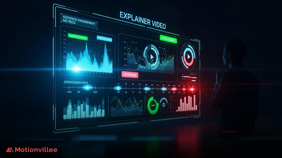
How Do You Know If Your Explainer Video Structure Is Actually Working?
Measure explainer video performance with completion rate, CTA click-through rate, demo request conversion, and landing page bounce rate because without data, you’re guessing what’s working. Your metrics reveal exactly what needs optimization.
Key metrics to track:
View completion rate (goal: 80%+ watch to the end)
- If completion is low, your opening isn’t hooking viewers. Redesign the problem statement.
- If viewers drop off at specific points, that section isn’t working. Reshoot or cut it.
Click-through rate on CTA (goal: 15-25% of viewers click)
- If CTA clicks are low, your call-to-action isn’t compelling. Test different CTAs and placements.
- Track which CTA versions drive higher click rates.
Demo request conversion rate (goal: 20-40% of clicks convert to bookings)
- If booking rate is low despite clicks, your messaging isn’t qualified enough. Refine your target audience.
- You may be attracting interest but not the right fit.
Landing page bounce rate (goal: under 40%)
- If viewers bounce immediately after clicking, your landing page messaging doesn’t match your explainer messaging.
- Align expectations between your explainer video and the page they land on.
A/B test structure elements Test different variables to find what converts best:
- CTA placement (45 seconds vs. 60 seconds vs. 75 seconds)
- Script length (60 seconds vs. 90 seconds vs. 2 minutes)
- Opening hook (emotional vs. statistical)
- Visual pacing speed
Track which variations deliver the highest completion and conversion rates. Use that data to optimize your next explainer.
When exploring innovative techniques, test them against your baseline to measure actual impact.
What Are the Most Common Structural Mistakes in SaaS Explainer Videos?
The five most common structural mistakes kill conversions even when production quality is high. Avoiding these mistakes alone improves results significantly.
1-Mistake: Burying the CTA at the end
- By the final frame, 20-30% of viewers have already left. Your CTA needs to appear at 45-60 seconds, not at 90 seconds. Test earlier CTA placement. You’ll often see conversion rates improve.
2-Mistake: Spending too long on company background
- “We were founded in 2015 and have 200 employees” doesn’t drive conversions. No one cares about your company history. They care about solving their problem. Jump into the problem within the first 10 seconds. Save company details for after they’re already interested.
3-Mistake: Weak opening hook
- “Hi, welcome to our product” doesn’t work. “This process is costing you $200K per year” does. Your opening hook must be attention-grabbing and immediately relevant. If viewers don’t feel spoken to in the first 5 seconds, they’re gone.
4-Mistake: Unclear value proposition
- If viewers finish your explainer unsure whether you’re a sales tool, marketing platform, or data solution, your messaging structure failed. Be specific about the job your product does. Name it clearly. No ambiguity.
5-Mistake: Mismatched messaging for buyer stage
- A solution-aware prospect watching a problem-awareness explainer feels bored. An unaware buyer watching a differentiation-focused explainer feels confused. Your SaaS explainer video structure must match the awareness level of your audience, or conversions suffer. Segment your videos by buyer stage rather than creating one generic version.
The fix: Your SaaS explainer video structure must match the awareness level of your audience, or conversions suffer. Segment your videos by buyer stage rather than creating one generic version.
When choosing production partners, ensure they understand buyer stage segmentation.
Understanding what makes specialists different helps you find teams who prioritize structure over decoration.
Production Tools and Team Requirements
Effective SaaS explainer video structure requires both strategic thinking and proper execution tools.
Essential capabilities:
Strategic Planning:
- Script development expertise
- Buyer journey mapping
- Conversion optimization knowledge
Production Execution:
- Professional animation software
- Design tools for visual consistency
- Analytics platforms for testing
Understanding what tools you need helps you build or outsource capabilities effectively.
Building Scalable Video Programs
Once you master SaaS explainer video structure, scale it across multiple assets.
Systematic approach:
Template Development:
- Create structure templates for each buyer stage
- Document successful messaging patterns
- Build reusable visual systems
Testing Infrastructure:
- Establish A/B testing protocols
- Track performance metrics consistently
- Iterate based on data
Team Training:
- Train teams on structural principles
- Share successful examples
- Create feedback loops
Learning storyboarding processes shows how structure translates from concept to execution.
Ready to Structure Your Explainer Video for Conversions?
Understanding structure drives conversions. The best-looking explainer videos fail when they lack strategy. The most modest videos convert at high rates when structured properly.
Your action plan:
1-Step: Define your target buyer and their awareness level
- Identify the specific persona you’re targeting
- Determine if they’re unaware, problem-aware, or solution-aware
- List their biggest problems and what success looks like
2-Step: Build your messaging structure
- Open with their problem (not your product)
- Agitate the pain and build urgency
- Introduce your solution as the answer
- Show what changes when they use you
- End with a specific CTA
3-Step: Write your script with conversion in mind
- Use simple language (no jargon)
- Name their specific problem
- Quantify the impact
- Make your CTA crystal clear
4-Step: Design visuals that guide attention
- Use color and motion to emphasize key points
- Match pacing to your script
- Keep design professional and clean
- Maintain consistency throughout
5-Step: Measure performance and iterate
- Track completion rate, CTA clicks, and demo bookings
- Identify where viewers drop off
- A/B test different elements
- Optimize based on data
The systems and practices you’ve learned transform explainer videos from nice-to-have content into revenue-generating assets.
Ready to implement strategic SaaS explainer video structure? Build your video with teams who prioritize conversion-focused structure, ensuring every second drives prospects toward action.
Start with one well-structured explainer targeting your highest-value buyer. Measure its performance. Then scale what works.